Pharmacy Map
GoodRx
GoodRx is a resource that helps uninsured or underinsured patients save on their prescriptions by providing coupons at thousands of pharmacies. I was the design lead on a new professional mode of the website, Provider Mode, aimed at helping doctors find savings for their patients.
I led research on understanding prescription decision making, then developed a solution to help unify affordability and e-prescribing workflows to reduce medication/pharmacy changes.
Reframing the product flow for prescribers
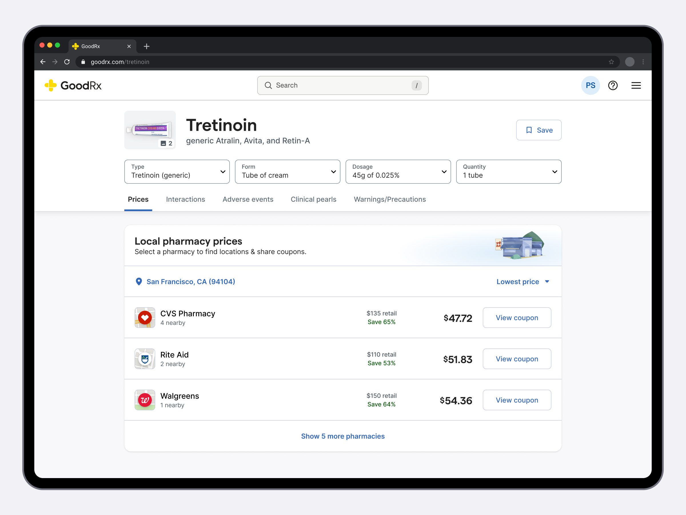
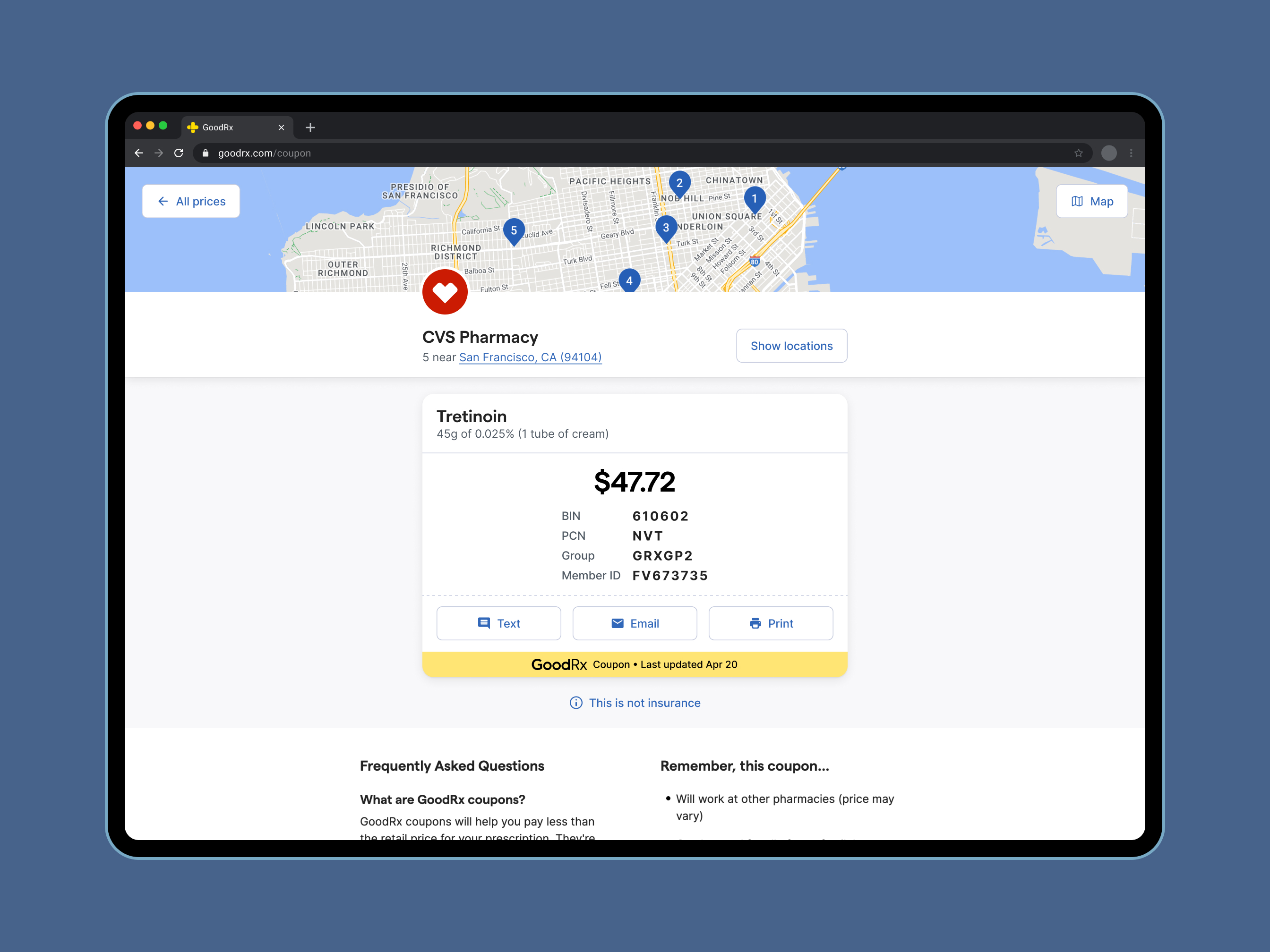
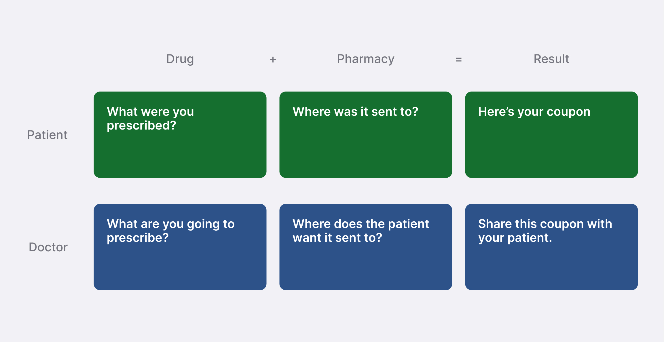
The core product experience involves searching for a drug, selecting a pharmacy, and getting a coupon. Although this system worked well for patients, it wasn’t the most straightforward for doctors who were still deciding what to prescribe and where to send it.
I reframed the questions we ask users in our product to ones with a doctors lens. Doing this allowed the team to look at the current experience from a new angle to identify new opportunities for adjustment.
Helping doctors find a location
Often times people coming to our site discover their “go-to” pharmacy isn’t the cheapest option. This means the EMR system the doctor uses to prescribe likely won’t have the address of the pharmacy already on file. Additionally, the doctor won’t always know the patient’s area well enough to choose a specific location for them.
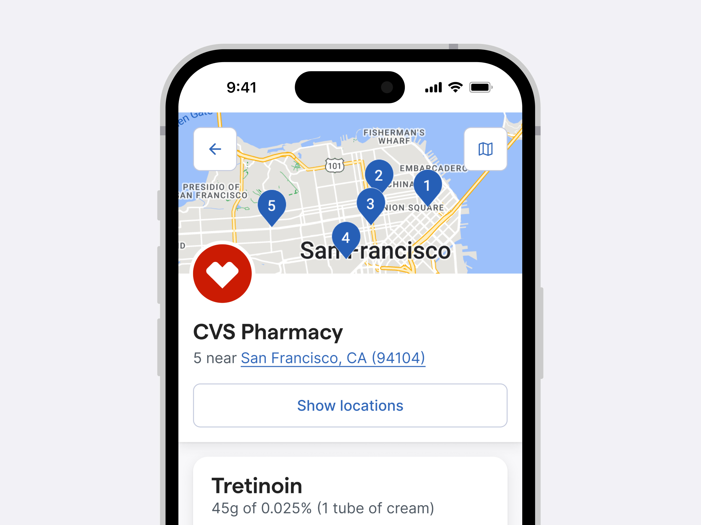
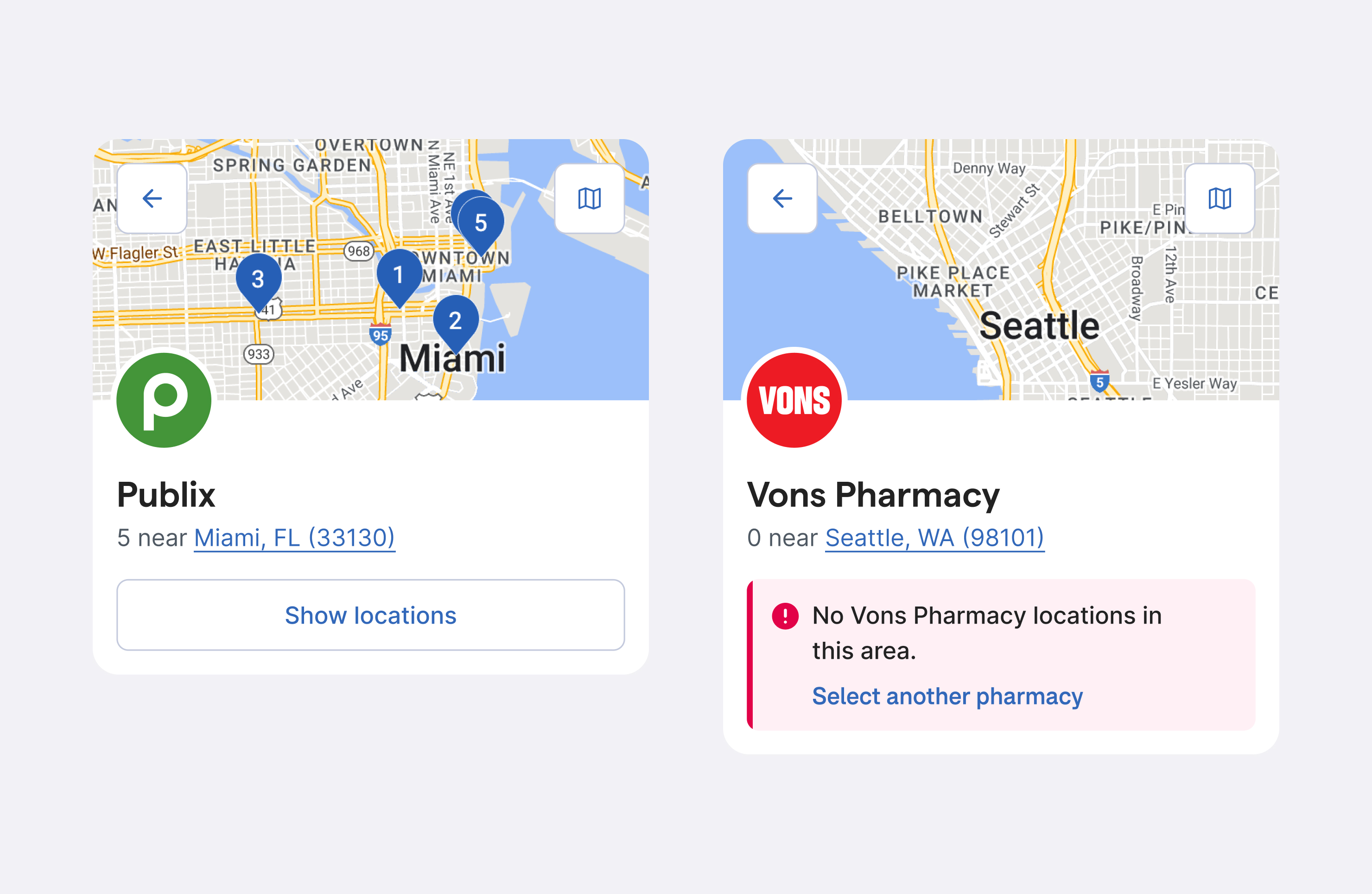
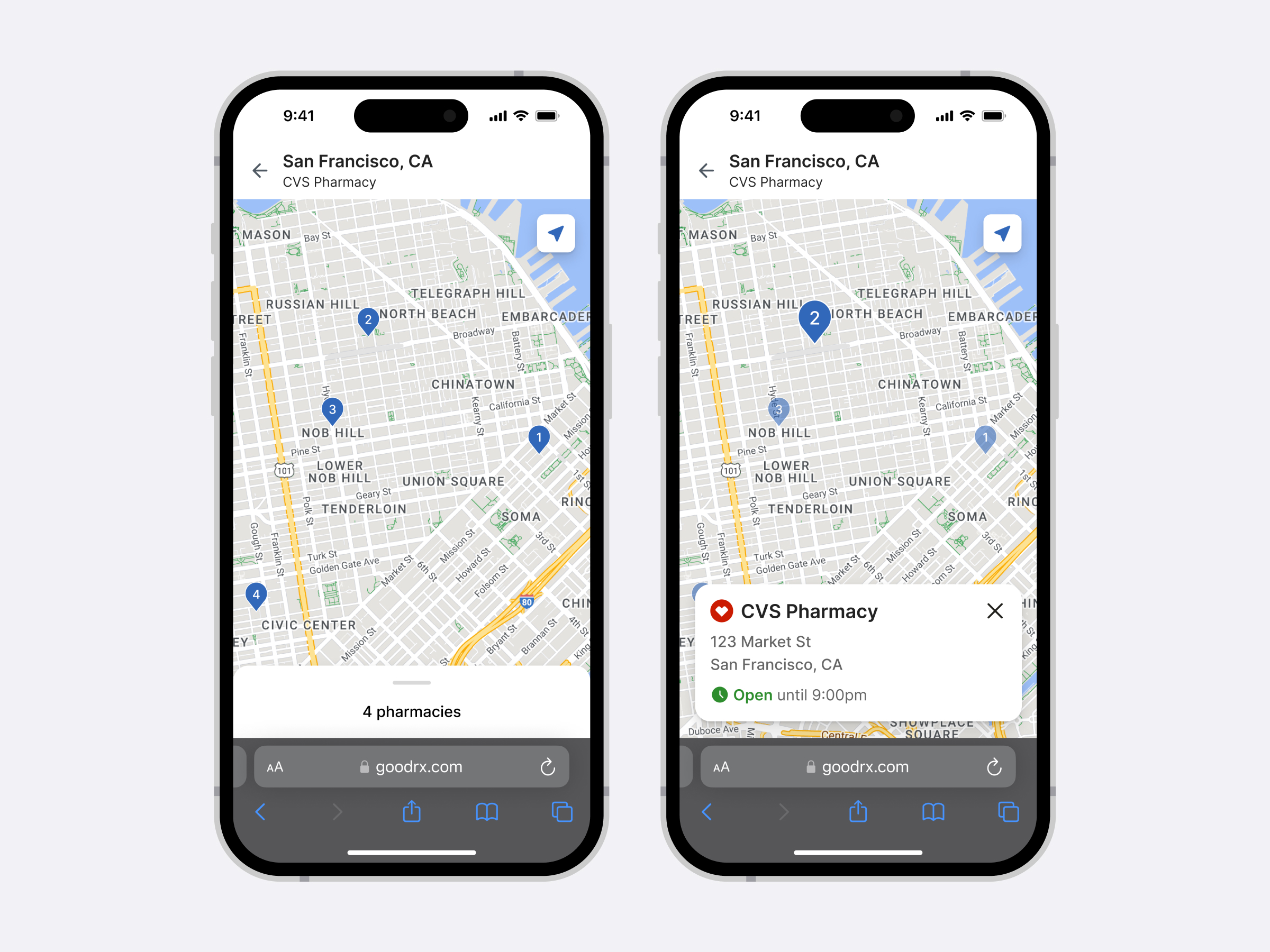
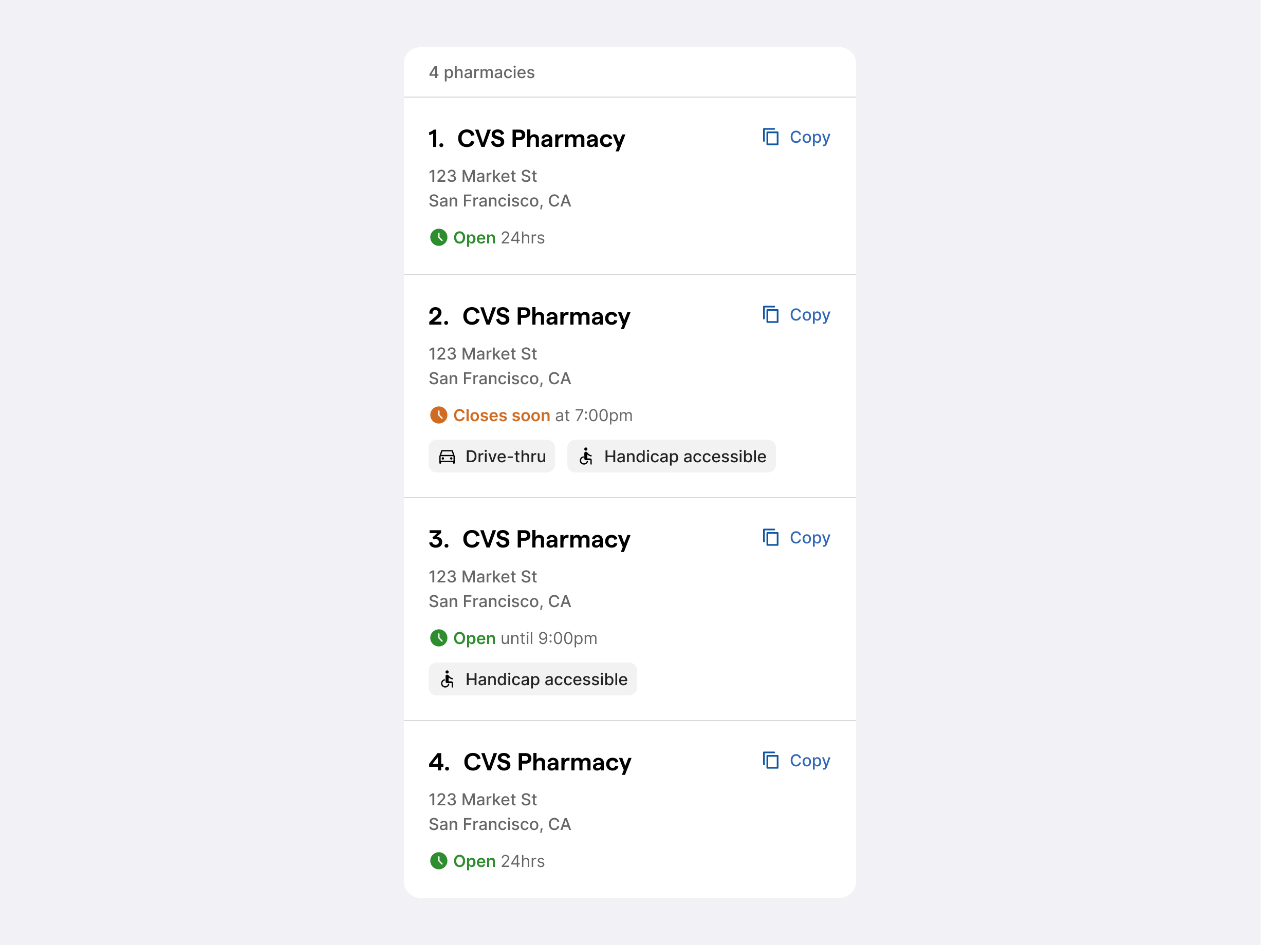
Once a doctor selected a pharmacy, we had an opportunity to help them find a location for their patient — allowing us to transition them naturally from finding a price on our site, back to their EMR to prescribe.
We netted out with a page that acted more as a chain storefront which showed locations nearby as well as the coupon. Our proxy metric of success was doctors copying the address of a store to their clipboard.
Identifying additional product entry points
During research we noticed not all doctors clicked on a pharmacy, but rather got the pricing information they needed just by scanning.
This sparked explorations of integrating locations into our table of prices. I developed a mix of backgrounds to represent a map with the pharmacy logo acting as the pin. The goal of this direction was to strike the balance of familiarity and new functionality let users discover naturally.
